[vc_row type=”full_width_background” full_screen_row_position=”middle” column_margin=”default” column_direction=”default” column_direction_tablet=”default” column_direction_phone=”default” bg_color=”#ffffff” scene_position=”center” text_color=”dark” text_align=”left” row_border_radius=”none” row_border_radius_applies=”bg” overlay_strength=”0.3″ gradient_direction=”left_to_right” shape_divider_position=”bottom” bg_image_animation=”none” shape_type=””][vc_column column_padding=”no-extra-padding” column_padding_tablet=”inherit” column_padding_phone=”inherit” column_padding_position=”all” column_element_spacing=”default” background_color_opacity=”1″ background_hover_color_opacity=”1″ column_shadow=”none” column_border_radius=”none” column_link_target=”_self” gradient_direction=”left_to_right” overlay_strength=”0.3″ width=”1/1″ tablet_width_inherit=”default” tablet_text_alignment=”default” phone_text_alignment=”default” bg_image_animation=”none” border_type=”simple” column_border_width=”none” column_border_style=”solid”][divider line_type=”No Line” custom_height=”50″][vc_column_text]
Brand identity examples that pass the logo scalability test
Before talking about logo scalability, we should talk about logo legibility.
What is legibility?
Legibility is the quality of being clear enough to read and or recognize.
Logo Legibility
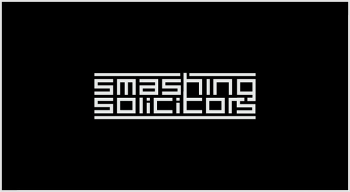
1. A logo should be simple.
If it contains too many elements and fine details, they will get lost when used in smaller sizes. Complex logos tend to get forgotten and confused with other similar logos. Classic examples of complex logos are governmental logos. Some have done it very well but others are just too much.
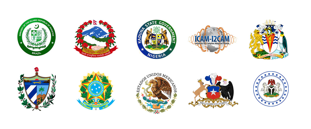
These logo examples portray how the finer details get lost when used in smaller sizes. They are impossible to remember and to redraw. Let’s take the first one the name is so small that you can not even read it anymore and the illustrations in the crest are just a scribble due to the small size. The other logos are more of the same. Too many details get lost when used in smaller sizes.
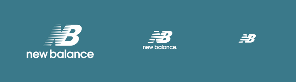
In addition to being simple, the best logos are often horizontal logos in a ratio of 1: 2. They tend to be more legible. We are conditioned to see everything around us in a horizontal manner because we have 2 eyes positioned horizontally next to each other. When seeing vertical logos it feels awkward although sometimes very subtle. When possible, always choose a horizontal logo over a vertical one.
2. Choose an easy-to-read font.
Fonts convey character and personality. Oftentimes than not designers get lost conveying character, personality, and meaning while losing the power of legibility. What good is personality, meaning, and character if no one can read what they’re looking at? Don’t be smart trying to push every meaning of a company into a logo. A logo is a mark that should be easily recognized. It’s a form of identification and not a message in itself. If it’s easy enough it will stand a chance in standing out. With the right branding identity system over time, it will be appreciated.
Bad Fonts Examples
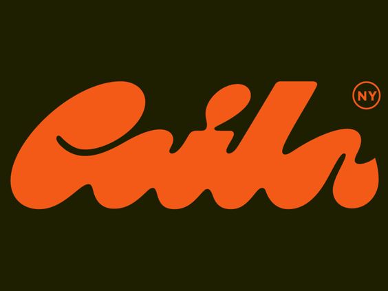
Can you read it correctly? This is a classic example of focusing on wordplay and forgetting legibility.

The first thing you read is NY because the logo itself isn’t legible. It’s too abstract and the shape itself isn’t as distinct to be recognized.
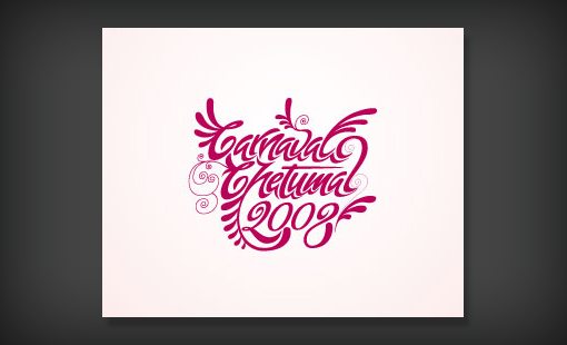
How long did it take you to figure out the name of the company?

You can recognize the intent to associate the logo with Carnival, all the swirls, and fanfare but again, the name gets lost in all the elements.
It takes too much to read. Imagine passing by on a highway driving 70 miles/hour. All that you would remember is a reddish swirly shape.
Good font examples

Simple, easy to read, and topped off with a hidden meaning in the negative space between the E and the x.
Can you spot the arrow? It symbolizes that the company moves fast.

Imagine Netflix using a font filled with 1’s and 0’s like the Matrix combining it with a font that looks like a film strip.
That would be horrible and painful for your eyes to read. They’ve done it correctly, simple and legible.

Simple does not mean meaningless. Although simple, this logo contains powerful meanings.
Do you see the arrow from a to z? It stands for the fact that Amazon sells everything from a to z.
At the same time, the arrow forms a smiling mouth symbolizing that Amazon’s customers are satisfied with their service.
How do you know if a logo is scalable?
The only way to know if your logo is scalable is to test it out. Not necessarily print it out on a plane and then on a pen to see if it works, but you can harness the power of brand identity mockups to test it out.
What is the minimum size for a logo?
Logos live in the digital world as well as in the physical. You should take this into account when building a brand identity system. Imagine getting a notification on your phone, how small does that Facebook or Instagram logo appear? Probably less than a quarter-inch even on the biggest mobile screens. It goes the same when using it as a favicon( that little logo at left in your browser tab.)
Logo Responsiveness
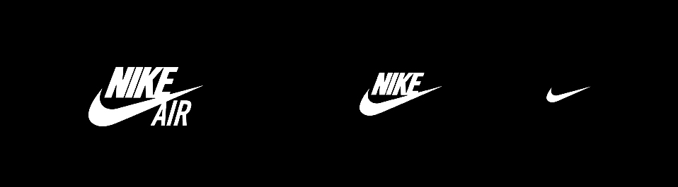
Even the best of logos should get adapted to read better depending on the size it’s being used in. A responsive logo can adapt in shape and form to fit anywhere it’s placed no matter how small while maintaining legibility. Joe Harrison created a site to explore the possible responsiveness of famous logos. The following examples are from this website.
Conclusion
In conclusion, a logo can pass the scalability test if it translates well in all sizes, big and small, and should be designed with responsiveness in mind. To fit well in all sizes, the logo should be simple and you should use easy-to-read fonts because too many details will get lost in smaller sizes.
[/vc_column_text][divider line_type=”No Line” custom_height=”100″][/vc_column][/vc_row][vc_row type=”full_width_background” full_screen_row_position=”middle” column_margin=”default” column_direction=”default” column_direction_tablet=”default” column_direction_phone=”default” bg_color=”#17c9bc” scene_position=”center” text_color=”dark” text_align=”left” row_border_radius=”none” row_border_radius_applies=”bg” overlay_strength=”0.3″ gradient_direction=”left_to_right” shape_divider_position=”bottom” bg_image_animation=”none” shape_type=””][vc_column column_padding=”no-extra-padding” column_padding_tablet=”inherit” column_padding_phone=”inherit” column_padding_position=”all” column_element_spacing=”default” background_color_opacity=”1″ background_hover_color_opacity=”1″ column_shadow=”none” column_border_radius=”none” column_link_target=”_self” gradient_direction=”left_to_right” overlay_strength=”0.3″ width=”1/2″ tablet_width_inherit=”default” tablet_text_alignment=”default” phone_text_alignment=”default” bg_image_animation=”none” border_type=”simple” column_border_width=”none” column_border_style=”solid”][divider line_type=”No Line” custom_height=”50″][vc_column_text]
Get more free content
[/vc_column_text][/vc_column][vc_column column_padding=”no-extra-padding” column_padding_tablet=”inherit” column_padding_phone=”inherit” column_padding_position=”all” column_element_spacing=”default” background_color_opacity=”1″ background_hover_color_opacity=”1″ column_shadow=”none” column_border_radius=”none” column_link_target=”_self” gradient_direction=”left_to_right” overlay_strength=”0.3″ width=”1/12″ tablet_width_inherit=”default” tablet_text_alignment=”default” phone_text_alignment=”default” bg_image_animation=”none” border_type=”simple” column_border_width=”none” column_border_style=”solid”][/vc_column][vc_column column_padding=”no-extra-padding” column_padding_tablet=”inherit” column_padding_phone=”inherit” column_padding_position=”all” column_element_spacing=”default” background_color_opacity=”1″ background_hover_color_opacity=”1″ column_shadow=”none” column_border_radius=”none” column_link_target=”_self” gradient_direction=”left_to_right” overlay_strength=”0.3″ width=”5/12″ tablet_width_inherit=”default” tablet_text_alignment=”default” phone_text_alignment=”default” bg_image_animation=”none” border_type=”simple” column_border_width=”none” column_border_style=”solid”][/vc_column][/vc_row][vc_row type=”full_width_background” full_screen_row_position=”middle” column_margin=”default” column_direction=”default” column_direction_tablet=”default” column_direction_phone=”default” bg_color=”#17c9bc” scene_position=”center” text_color=”dark” text_align=”left” row_border_radius=”none” row_border_radius_applies=”bg” overlay_strength=”0.3″ gradient_direction=”left_to_right” shape_divider_position=”bottom” bg_image_animation=”none” shape_type=””][vc_column column_padding=”no-extra-padding” column_padding_tablet=”inherit” column_padding_phone=”inherit” column_padding_position=”all” column_element_spacing=”default” background_color_opacity=”1″ background_hover_color_opacity=”1″ column_shadow=”none” column_border_radius=”none” column_link_target=”_self” gradient_direction=”left_to_right” overlay_strength=”0.3″ width=”1/1″ tablet_width_inherit=”default” tablet_text_alignment=”default” phone_text_alignment=”default” bg_image_animation=”none” border_type=”simple” column_border_width=”none” column_border_style=”solid”][divider line_type=”No Line” custom_height=”25″][/vc_column][/vc_row][vc_row type=”full_width_background” full_screen_row_position=”middle” column_margin=”default” column_direction=”default” column_direction_tablet=”default” column_direction_phone=”default” bg_color=”#17c9bc” scene_position=”center” text_color=”dark” text_align=”left” row_border_radius=”none” row_border_radius_applies=”bg” overlay_strength=”0.3″ gradient_direction=”left_to_right” shape_divider_position=”bottom” bg_image_animation=”none” shape_type=””][vc_column column_padding=”no-extra-padding” column_padding_tablet=”inherit” column_padding_phone=”inherit” column_padding_position=”all” column_element_spacing=”default” background_color=”#17c9bc” background_color_opacity=”1″ background_hover_color_opacity=”1″ column_shadow=”none” column_border_radius=”none” column_link_target=”_self” gradient_direction=”left_to_right” overlay_strength=”0.3″ width=”1/2″ tablet_width_inherit=”default” tablet_text_alignment=”default” phone_text_alignment=”default” bg_image_animation=”none” border_type=”simple” column_border_width=”none” column_border_style=”solid”]
[/vc_column][vc_column column_padding=”no-extra-padding” column_padding_tablet=”inherit” column_padding_phone=”inherit” column_padding_position=”all” column_element_spacing=”default” background_color_opacity=”1″ background_hover_color_opacity=”1″ column_shadow=”none” column_border_radius=”none” column_link_target=”_self” gradient_direction=”left_to_right” overlay_strength=”0.3″ width=”1/12″ tablet_width_inherit=”default” tablet_text_alignment=”default” phone_text_alignment=”default” bg_image_animation=”none” border_type=”simple” column_border_width=”none” column_border_style=”solid”][/vc_column][vc_column column_padding=”no-extra-padding” column_padding_tablet=”inherit” column_padding_phone=”inherit” column_padding_position=”all” column_element_spacing=”default” background_color_opacity=”1″ background_hover_color_opacity=”1″ column_shadow=”none” column_border_radius=”none” column_link_target=”_self” gradient_direction=”left_to_right” overlay_strength=”0.3″ width=”5/12″ tablet_width_inherit=”default” tablet_text_alignment=”default” phone_text_alignment=”default” bg_image_animation=”none” border_type=”simple” column_border_width=”none” column_border_style=”solid”][vc_column_text]Share your inbox and we will continue to share value packed resources on branding.[/vc_column_text][/vc_column][/vc_row][vc_row type=”full_width_background” full_screen_row_position=”middle” column_margin=”default” column_direction=”default” column_direction_tablet=”default” column_direction_phone=”default” bg_color=”#17c9bc” scene_position=”center” text_color=”dark” text_align=”left” row_border_radius=”none” row_border_radius_applies=”bg” overlay_strength=”0.3″ gradient_direction=”left_to_right” shape_divider_position=”bottom” bg_image_animation=”none” shape_type=””][vc_column column_padding=”no-extra-padding” column_padding_tablet=”inherit” column_padding_phone=”inherit” column_padding_position=”all” column_element_spacing=”default” background_color_opacity=”1″ background_hover_color_opacity=”1″ column_shadow=”none” column_border_radius=”none” column_link_target=”_self” gradient_direction=”left_to_right” overlay_strength=”0.3″ width=”1/1″ tablet_width_inherit=”default” tablet_text_alignment=”default” phone_text_alignment=”default” bg_image_animation=”none” border_type=”simple” column_border_width=”none” column_border_style=”solid”][divider line_type=”No Line” custom_height=”50″][/vc_column][/vc_row]